Showing posts with label Clearly Inspired Challenge. Show all posts

Friday, September 7, 2012

CIC59 - Leaves


This week Clearly Inspired Challenge #59 is Leaves, a little or a lot of leaves on your project. Here's the card I made with one of the adorable images designed by Lisa Lara at Clear Dollar Stamps. I used the outline version so I could color the little guy to look like my oldest grandson and to match my paper.


I hope this inspires you to create your own card with leaves and join us at the Clearly Inspired Challenge at Clear Dollar Stamps where you can also check out the cool cards made by the other members of the design team.

I'm sharing this card with the following challenges:
Cute Card Thursday Challenge #233 - Autumn Gold
Fab 'n' Funky Challenge #137 - Colors of Autumn
Inspired By #40 -(photo of a stack of autumn colored blankets)


Card Recipe:
Digital Image - CDS Piles of Fun
Ink - CTMH Autumn Terracotta, Honey
Markers - CTMH Alcohol Honey, Autumn Terracotta, Autumn Terracotta Light, Twilight, Twilight Dark; Copics E35 Chamois, E18 Copper, E00 Skin White, E11 Barely Beige, 0 Blender
Paper - CTMH "Clementine," Colonial White, Chocolate cardstock
Accents - CTMH Chocolate grosgrain ribbon, Sorbet Waxy flax, retired button
Tools - Printer, CTMH Cricut Art Philosophy cartridge (stacked leaves), large corner rounder
Technique - I traced the smallest leaf that I cut around the printed title and cut out. I inked the edges of the top leaf with the sponge and the bottom two with alcohol markers.

Friday, July 20, 2012

Clearly Inspired Challenge #56 - Get Wet


Last week we spent a couple of days in the Gulf enjoying sea breezes and playing on the beach. After several weeks of mostly triple digit heat where we live, it was refreshing. My grandchildren had never seen the sea before. I wanted them to see the beauty of the waves coming in, to find its treasures left on the sand, to relax with the peaceful splashing of wave after wave endlessly praising their Maker. We saw firsthand the reality of the verses from Psalms that refer to the sea and the waves singing praise or making a joyful noise to the Lord.


Christian enjoyed standing in the waves and watching little fish come up to his legs.


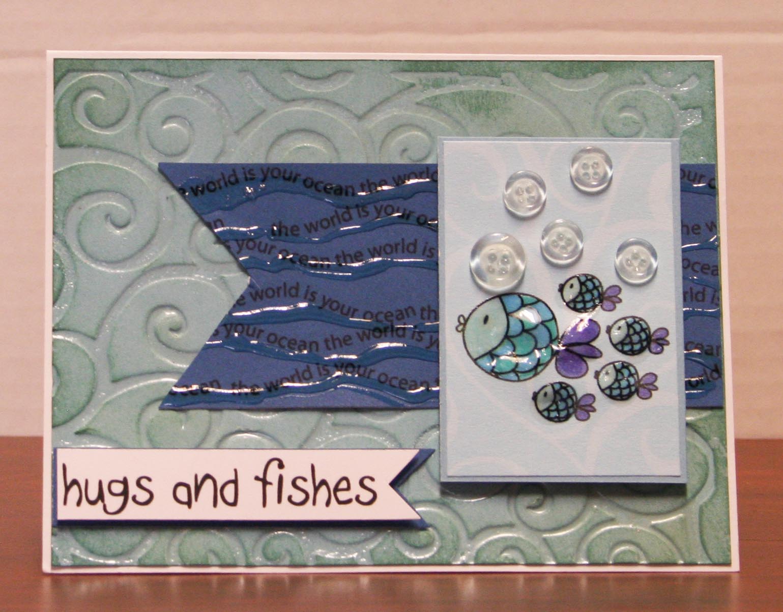
So naturally my mind was on the sea with this challenge to "Get Wet:"  Use wet images, wet look techniques/products acetate, dimensional glaze, etc. Here's what I came up with:


I used this July 1st sketch from Stars and Stamps - Operation Write Home. On the 2" x 4.5" piece banner, shape I covered it with the flowing words "the world is your ocean" from the Splash digital image set from Clear Dollar Stamps. I made it by copying and pasting it over and over using Photoshop. Then I flattened the layers. I used Crystal Effects to "draw" just below each row of flowing words to add more of a wet look. The fish were printed on blue swirl patterned paper, colored with Copic markers, given clear buttons as air bubbles and a light coat of Crystal Effects for additional "wet look. "


I used a third technique to imitate wetness on the background. Using a brayer, I rolled Versamark clear ink over the raised pattern on the Divine Swirls embossing folder. I set my paper to be embossed on the opposite side and carefully closed the wet side over the paper. I ran it through my Wizard, opened and removed it carefully, then sprinkled clear embossing powder over the wet, debossed design (the swirls are pushed in rather than standing up). I used a heat gun to set the embossing powder and sponged Juniper ink over the edges of the paper.

I thought this card would be a good one for one of our service men or women to send home to family, so I chose an affectionate sentiment, that is, if I can keep from sending it to my grandkids!

This card was enterred into the following challenges:
Divas by Design #44 - Anything Goes
Make It Monday #98 - Anything Goes
Sarah Hurley Challenge Blog #70 - Buttons (I used them for air bubbles.)
Use It Tuesday #35 - Emboss It ( I used embossing folder, Versamark and clear embossing powder for my background. My hoarded supplies are the clear buttons I purchased in bulk several years ago.)

4.25" x 5.5" Card Recipe:
Paper - Close To My Heart Crystal Blue, Pacifica, White Daisy cardstock and scrap of old crystal blue swirls patterned paper
Images - Clear Dollar Stamps "Splash"
Inks - Juniper, Versamark
Copic Markers - B02, BG10, BG13, BV04
Accents and Tools - CTMH Clear Button Collection, Versamark clear ink, Clear embossing powder, Cuttlebug "Divine Swirls" embossing folder, brayer, heat gun, Crystal Effects, pop dots


Friday, July 6, 2012

Clearly Inspired Challenge #55 - Some Like It Hot!


The temperatures outside today will be 104 degrees, so this new challenge is very appropriate. The local news keeps mentioning people in our area have died from the heat, which prompts me to pray for my daughter's husband and so many others who work outside with no shade for relief. 

Personally, I can't take the heat. However, I'm babysitting four grandchildren a couple of days each week and need to take them outside or on little "field trips" so that the three boys can burn up some of that aggressive energy. I've been praying for God's grace to help me adjust and I've considered these 102 degree days "training" for the trip we're about to take to Texas, where I know the heat will be even worse. 

It's amazing that Psalm 54:11 talks about God being our sun and shield, giving us grace and glory. The analogy makes me think of Him as one who warms our spirit, gives light to our paths and yet shields us from the negative things in life -  or perhaps even the extreme heat!

I used a rainbow of hot colors and a sun from the Clear Dollar Stamps digital image "Light of His Love" to illustrate this challenge.

I used this week's sketch from Mojo Monday Challenge #248 for this card.  I punched a 1.5" circle from the same orange designer paper, placed it over the sun image because the pattern in the paper reminded me of close up photos of the sun.  Then I dotted around it with red stickles for emphasis and contrast.


Whether you like the heat or not, may God bless you as you experience the warmth of His love and see His light working in your life today.

Additional Challenges for this card:
Catered Crop - rainbows or colors of the rainbow
Oozak Challenge #4 - bright colors
Mojo Monday 248 - sketch
Shopping Our Stash #58 - at least three from list. I used: ribbon, flowers, punch, die cut, rhinestones

5" x 6.5" Encouragement Card Recipe:
Images - Clear Dollar Stamps digis "Light of His Love"
Paper - Basic Grey "Life of the Party;" Close To My Heart Sunny Yellow, Dutch Blue, Cranberry, White Daisy cardstock
Copic Markers - Y13 Lemon Yellow, YR68 Orange, B24 Sky
Accents and tools - Prima flowers, red stickles, Making Memories Navy Blue ribbon, Close To My Heart Bitty Sparkles, Spellbinders Wizard Scalloped Ovals Nestabilities, Martha Stewart border punch, 1.5" circle punch, printer


Saturday, April 14, 2012

Going Green - Glittery Birthday Card

Description of the Creative Process

It's interesting how creativity takes place when I'm cleaning up scraps of paper from my table. I came across a green, glittery paper and remembered there were two challenges that could work for. Do You Stack Up posted challenge #67 to use glitter or stickles. Clearly i Stamp Challenge #49 is Go Green, either with the color green or in honor of Earth Day. I used the sketch from The Ribbon Carousel Challenge Blog #48.


With this card I decided to play around and try something new. The color of the paper suggested that white would be the best coordinating color. To add an organic feel to the card, I embossed the white middle panel with a Sizzix embossing folder and matted it on white that was edged with green stickles, not usual for me.

My husband thought the embossed panel looked out of place. Instead of removing it, I sprayed the it with glimmer mist that I'd had for six months and never used. Now it had a shine that went with the glittered effect of the other papers.

I used a digital flower image from Clear Dollar Stamp set called "New Butterfly." I colored the inside with a copics marker G20 which gave it a touch of color, then I sprayed it with glimmer mist, too. I tied the wide white grosgrain ribbon with a knot for a change.  This photo lets you see the glimmer mist before I added the sentiment.


Before printing my sentiment from the same set of digital elements, I wanted to make sure it also had a shine to it, so i printed it on glossy photo paper. I loved the fonts they used to make this sentiment and think it goes well with the papers. Here's the final result, although the lighting doesn't catch the glitter in this photo.


Wednesday, February 29, 2012

Multicolored Grace

This week the Stampin' Sisters in Christ Challenge is to make a multi-colored card because of this scripture used in their lesson: 

1 Peter 4:10: “As each one has received a special gift, employ it in serving one another as good stewards of the manifold grace of God.” There is the word, manifold which translated means, multicolored. Many-colored grace. 

I personally believe He shows us each grace in many different ways, dealing with us as unique individuals, not as carbon copies. When my oldest daughter was just a toddler, we moved to a parsonage where someone had planted irises of every hue, all different, surrounding the yard. I was amazed that there could be so many different kinds of irises. That's when I realized my cranky, picky-eater two-year-old was different than the children whose parents kept giving me advice. If God made so many different kinds of irises, he surely made many kinds of people, all lovely in their own way.  I knew she was unique and needed to be dealt with individually, the same way God deals with us. That totally changed the way I taught other people's children in school, treating each as individuals.
I still had a very colorful piece of Basic Grey that I thought was a multi-colored candidate. Then I saw the Clearly Inspired Challenge #46 at the Clearly iStamp blog to make a card that was not square or rectangle. I had recently purchased one of their digital stamps with a butterfly and flower and I knew they were meant for the multi-colored card. And here's the result blending the two challenges. I used the same procedure for cutting this card using my Cricut Art Philosophy cartridge that I mentioned on my earlier post today.


I had chosen this verse to make a card for one of my grandkids who was baptised a couple of weeks ago. My grandkids like to come to our farm and explore with me. Nature has so many spiritual truths to teach us. I hope they all learn the lessons of the new life we have in Christ and relying on His power to remove old habits, old fears, old inadequacies as He makes us more like Him.

Thank you ladies for your beautiful challenges.

6.5" x 5.25" card recipe:
Paper - Basic Grey "Color Me Silly;" CTMH Colonial White, White, Black Cardstock
Digital Stamp - Clear Dollar Stamps - New Butterfly
Other - Copic markers;CTMH -  black marker, Opaques -pearl, mocha, and licorice; Wilton doily