Showing posts with label Skipping Stones Design Sketch. Show all posts

Wednesday, February 1, 2012

A Guy Thing

Fashionable Stamping challenged us to Make It a Guy Thing, which I don't do often enough. I adore my hubby who loves to build old cars as eveidenced by the 34 Ford in our attached garage and the beginnings of a T-Bucket waiting to fill his new garage. He definitely needs to put a heater in his new garage so he can enjoy his hobby year round. I made this card with him in mind, using the sketch from the Skipping Stones Design Sketch Challenge #113.


I was disappointed that there was a small piece of lint on the "H" so that it didn't stamp well, but it sort of looks like it belongs on my shabby card and I know a man who will never know the difference - hel'll only be looking at the car!

5.5" square card:
Paper - Graphic45 "Playtimes Past;" Close To My Heart Kraft, Colonial White, Outdoor Denim CS
Stamps - CTMH "Happy Birthday," Vintage Father's Day (both retired)
Ink - CTMH Desert Sand, Black, Outdoor Denim, Cranberry
Other -  CTMH Cricut Art Philosophy (circles), Lucky Level Two Assortment (chipboard stars)

Monday, January 9, 2012

Warm and Fuzzy Kraft heARTwork

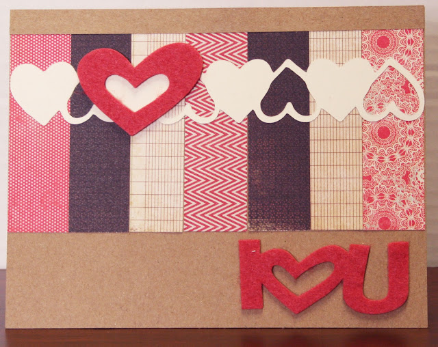
After a very busy weekend (two granddaughters' birthdays, a funeral, babysitting, two grandsons' basketball game) I'm starting today with an easy card. I didn't do any stamping for a change, but used a felt sentiment and heart as part of the Little Red Wagon Challenge #114 - Warm Fuzzies with felt or flocking.


I used Skipping Stones Design Sketch #109, a 1" heart border cut using Cricut's Paper Lace cartridge. But the stars of the show are Close To My Heart's felt heart and sentiment. I loved this combination of red, Colonial White, and black DP on Kraft CS. This has been one of my favorite color combinations for a long time, so I'm entering this card in The Kraft Journal's Make It Monday: Favorite Colors Challenge. I love the look of felt on Kraft cardstock.


Wednesday, December 14, 2011

In the City of Bethlehem

When I saw Jen del Muro's Design Sketch #106 for Skipping Stones Design, I wanted to do something unique with the three strips. I had been looking for a way to use the CTMH stamp set called "Glory to God," particularly the wise men and Bethlehem in layers. This sketch inspired me to heat emboss the star on the top layer and put Bethlehem on the middle layer. The wise men are stamped on a red patterned paper that has horizontal streaks kind of like wood grain. They don't really show up in the photo, but it gives the impression of the silhouette of the wise men at sunset or dusk. Of course, I had to flip the design so that the circle was on the left since the wise men are going "east" and one of them is pointing to the star in the "east."


I used the same design for the manger scene, but the star and red paper didn't show up well with the angle it was photographed.