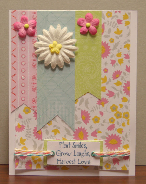
Wednesday, February 29, 2012

Multicolored Grace

This week the Stampin' Sisters in Christ Challenge is to make a multi-colored card because of this scripture used in their lesson: 

1 Peter 4:10: “As each one has received a special gift, employ it in serving one another as good stewards of the manifold grace of God.” There is the word, manifold which translated means, multicolored. Many-colored grace. 

I personally believe He shows us each grace in many different ways, dealing with us as unique individuals, not as carbon copies. When my oldest daughter was just a toddler, we moved to a parsonage where someone had planted irises of every hue, all different, surrounding the yard. I was amazed that there could be so many different kinds of irises. That's when I realized my cranky, picky-eater two-year-old was different than the children whose parents kept giving me advice. If God made so many different kinds of irises, he surely made many kinds of people, all lovely in their own way.  I knew she was unique and needed to be dealt with individually, the same way God deals with us. That totally changed the way I taught other people's children in school, treating each as individuals.
I still had a very colorful piece of Basic Grey that I thought was a multi-colored candidate. Then I saw the Clearly Inspired Challenge #46 at the Clearly iStamp blog to make a card that was not square or rectangle. I had recently purchased one of their digital stamps with a butterfly and flower and I knew they were meant for the multi-colored card. And here's the result blending the two challenges. I used the same procedure for cutting this card using my Cricut Art Philosophy cartridge that I mentioned on my earlier post today.


I had chosen this verse to make a card for one of my grandkids who was baptised a couple of weeks ago. My grandkids like to come to our farm and explore with me. Nature has so many spiritual truths to teach us. I hope they all learn the lessons of the new life we have in Christ and relying on His power to remove old habits, old fears, old inadequacies as He makes us more like Him.

Thank you ladies for your beautiful challenges.

6.5" x 5.25" card recipe:
Paper - Basic Grey "Color Me Silly;" CTMH Colonial White, White, Black Cardstock
Digital Stamp - Clear Dollar Stamps - New Butterfly
Other - Copic markers;CTMH -  black marker, Opaques -pearl, mocha, and licorice; Wilton doily

I will restore you to health . . . Jeremiah 30:17

This week Our Daily Bread Designs Challenge #98 was to make a card other than a square or rectangle. I'm so glad I tried another one of the shape cards on my Cricut Art Philosophy cartridge. This one was on the 2nd row, 4th card from the right. By cutting it at 6" my card is 5" wide, just right for the envelopes I use. I also cut the background paper with the same basic shape for the top and added a "Layer" of the same shape from Chocolate cardstock. Because my card is partly open so that it will stand up, it looks like the frame doesn't match, but it does. That's the inside showing,


The most important thing about this card is the beautiful verse, a promise to be restored either physically, mentally, or emotionally. God wants us to bless us. Some of us go through physical trials as we age, but the mental and emotional peace that He gives us more than compensates for that aging process. As the aches and pains of being a grandma increase, I look forward to the day when God will completely restore me with a glorified body. I hope this verse will bring comfort to someone else that needs it.

I used two stamps from the Our Daily Bread Design's Get Well set. I stamped the butterflies with a Vintage Photo ink and colored them with a CTMH Sorbet marker. I traced the swirls with two different Copic markers. The entire sentiment block was stippled with Old Paper. I stamped the butterflies a second time and cut them out after coloring. The largest butterfly was white with music, so I colored it with a light peach Copic and colored the edges with the Sorbet from CTMH. All of the butterflies were glued just in the middle with Liquid Glass so that they would add dimension. There's round circle punched out of each side of the frame, so I put a new Pewter Badge Button on each as embellishment. The ribbon is a creamy gold color that shimmers but doesn't show well in this photo. I've been hesitant to make many cards that weren't rectangular. This challenge helped me get my feet wet!  Thank you ladies!

6" x 5" Card Recipe:
Paper - Basic Grey "Scarlet's Letter;" CTMH Chocolate, Colonial White, Sorbet cardstock
Stamps - Our Daily Bread Designs "Get Well"
Ink - Vintage Photo, Old Paper
Other - Copic markers; Close To My Heart Sorbet marker, Pewter Badge Buttons, Mocha Opaque Adhesive Gems, Liquid Glass, Creative Basics Mistletoe Ribbon (retired), Just Blooms -Flutter (largest butterfly)

Tuesday, February 28, 2012

Word Art Wednesday for Encouragement

In the past hour our weather man announced tornado warnings, high wind warnings, and hail. The weather maps showed that we were in line for the worst winds along with our children who live in different suburbs. I immediately prayed for their safety. There I am upstairs in my craft room looking for stamps, listening to the wind blow viciously against the one west window in the room, getting nervous, wondering if I should go downstairs. Then I looked at this sentiment I had printed and was "awakened" to the greater reality. I took a deep breath and let the calming green colors soak in along with my realization that I wasn't alone in that upstairs room with the wind blowing. The Lord promised to be there with me and He was in control. Thank you, ladies, for this Word Art Wednesday Challenge #16 that met  the need of the moment. Amazing how things like that work out. This card is the final result. I'm also posting this on Little Birdie Blessings where I get additional encouragement from the Word.


I used the sketch from Unscripted Sketches Challenge #147 this week and flipped it horizontally. Maybe it was the turmoil outside or the calm inside, but simplicity seemed best with this card. I printed the sentiment on a piece of paper from "Boxer." The floral silhouettes were each stamped twice, using first and second generation stamping.

6.5" x 5" Card Recipe:
Paper - Close To My Heart "Mayberry" dp (stamped with flowers); Basic Grey "Boxer,"  black cardstock
Stamps - CTMH "Treasure Life"
Ink - CTMH New England Ivy
Other - CTMH Pewter Badge Buttons

Zoology Birthday Card

I love taking grandkids to the zoo. We've had lots of good times there. It's a perfect birthday spot. So Here's a card I made for a grandson following the challenge at CCEE Stampers to make a card with a favorite zoo animal.


I cut out elephants from Basic Grey's Marrekech paper and mounted it on Close To My Heart paper. Then I stamped and layered several elements from three stamp sets the way I do when scrapbooking. I call it clustering. I stamp several things that I think would look good together using different colors. Then I "play" with them until I have a good combination.  Thanks, ladies, for the great inspiration. I probably wouldn't have made a card like this if it wasn't for your ideas.

5" x 6.5" Card Recipe:
Paper - Basic Grey "Marrekech" Close To My Heart "Mayberry," Colonial White, Garden Green, Dutch Blue, Vanilla cardstock
Stamps - CTMH - "Zoology" (elephant, ticket), Limited Edition (large tag, good times), "Heartfelt Treasures"(leaves)
Inks - Dutch Blue, Moonstruck, Olive
Other - CTMH Pewter Badge Button, Outdoor Denim Twill (retired)


Sweet Sketch A Flitter

I have several friends who absolutely LOVE pink, so when I saw this photo inspiration on Flutter By Wednesday's Challenge #190, I knew I needed to make a pink, flowery card. I used a glittery pink striped scrap so the sketch from Sweet Sketch Wednesday was just right, especially since I could add a flower and pink sparkles.


The butterflies were from a set called A Flutter. I stamped them in Hollyhock ink, colored them with a pink Copic marker, added details with a black 0.1 marker, then added Bitty Sparkles.

5.5" square card recipe:
Paper - Close To My Heart Baby Pink, Blush textured, White Daisy cardstock; DCWV "The Sweet Stack" dp; Basic Grey "Lemonade" (flowered strip)
Stamps - Close To My Heart "A Flitter," "What a Great Day"(retired)
Ink - Memento Tuxedo Black; CTMH Hollyhock
Other - Cuttlebug embossing folder; Recollections flower; Copic Markers YG03, R20; CTMH My Legacy Writer 0.1, Red/Pink Sparkles, Bitty Sparkles

Monday, February 27, 2012

Get Well, Naturally

Anyone who knows me knows that I'm really into natural healing as much as possible since I'm allergic to most antibiotics, food with pesticides, etc. But this card is inspired by City Crafter Challenge #97 to use natural colors and this sketch from Perfect Sentiments Challenge #20 to make a get well card.


In thinking about natural colors, I also thought about natural fibers and wanted to use canvas, twill, and jute. The smaller canvas scalloped circle was mounted on a Kraft cardstock circle and popdotted for dimension. I have some Kraft colored lace that I rarely get to use but really love when I see it in my ribbon box. It didn't photograph well, unfortunately. I thought the bottom part needed something more so I added a flower embellishment with a wooden button. Thank you ladies for the inspiration. Now I just need to figure out which of my sick friends gets it.

6.5" x 5" card:
Paper - Basic Grey "Scarlet's Letter, " CTMH Kraft cardstock
Stamp - CTMH "Best Wishes"
Ink - Ranger "Vintage Photo;" CTMH Autumn Terracotta (sponged on smaller scallop edges)
Other - Close To My Heart - Just Blooms flower, Wooden Buttons, Natural Jute; Technique Tuesday "Textile Scallops;" wide twill and lace unknown


MOJO Monday 230 Birthday Card

We're planning something special for my mother-in-law's 87th birthday, so I made this card for her today. Since it's the last Monday of the month, the MOJO Monday challenge is to make either a round or square card using this sketch:


I wanted to incorporate bright yellow into the colors of my card after walking down our long driveway seeing the buds of daffodils anxious to bloom. I found a scrap of June Bug that was definitely bright and cheery enough for this card. I left the upper portion white with polka dot embossing to match the polka dots in the paper. The sentiment is matted on black, then on a chipboard frame that I just got from Close To My Heart that I couldn't wait to use. Each shape for journaling has a different design embossed, waiting to be inked. I used a sponge and holiday red, then cranberry to ink the polka dotted  border. Instead of having three flowers on the left, I put three other mixed elements. The flower is felt. The butterfly was a white one in a set of CTMH Just Blooms. I used a black marker to outline the shape and attached clear and red sparkles. The yellow ribbon reflected enough light to make the red sparkles appear yellow in the photo.

Since I won't be mailing this card, I purposely made the yellow ribbon longer than the width of the card to go along with the challenge from Our Creative Corner to go "Over the Edge." That also allowed me to focus more on the daffodil color that I can't wait to see in my yard!

5.5" square card recipe:
Paper - Basic Grey "June Bug;" Close To My Heart White Daisy, Black cardstock
Stamp - CTMH Birthday Script (retired)
Ink - Memento Tuxedo Black
Other - Close To My Heart "Persnickety Journaling Spots" Irrisistibles, Clear and Red/Pink sparkles, Just Blooms butterfly; Martha Stewart border punch; K and Co felt rose; ribbon unknown

Sunday, February 26, 2012

God Bless You Birthday Card

Here is the last Viva La Verve challenge card for the month of February. I wanted to use a floral branch of chipboard that reminds me that spring is on the way. The Little Red Wagon challenge to use chipboard this week really did the trick. I love adding dimension to cards. I wanted to do something different with this simple Verve sketch. I used more papers from Basic Grey's Boxer. There were three greens. So I added an aqua scalloped "circle 2" cut at 3" on Cricut Art Philosophy for contrast. Since the verse I'd chosen to use from Verve wouldn't take up much room on my three inch circle, I made my inner circle only two inches and planned to put the branch across the circle and the horizontal strip for cohesiveness. I tied a little natural jute around two stems of the branch as the simple finishing touch. Here's the simple sketch from Verve:


5" x 6.5" Card recipe:
Paper - Basic Grey "Boxer;" My Mind's Eye "Lost & Found" (aqua)
Stamp - Verve "Joy for the Journey"
Ink - Memento Tuxedo Black
Other - Basic Grey "Curio" chipboard; Close To My Heart - Cricut Art Philosophy, jute

May You Prosper

Jeemiah 29:11 is such a beautiful verse to share with a friend. I keep using it again and again. Today I used it for the Viva La Verve Challenge for February, Week 3. I combined it with the Challenge from Craft Your Passion: This week's challenge is in honor of President's Day here in the USA,
RED, WHITE & BLUE


May God prosper and bless our nation as well as individuals as this verse says.


Because the sentiment on my card is fairly large, the three inch circle takes up a lot of room without a border in the back. So I chose to sponge Outdoor Denim ink around the edges for more definition.

6.5" x 5" Card Recipe:
Paper - Basic Grey "Boxer," "June Bug"and "Marekesh;" Close To My Heart White Daisy Cardstock
Stamp - Verve Jeremiah 29:11 Plain Jane
Ink - Memento Tuxedo Black; CTMH Outdoor Denim
Other - CTMH "Bohemian Assortment"(doily and button), Colonial White Waxy Flax, 3" and 2" circle punches

Masculine Card in Weathered Kraft, Red, White, and Blue

I'm celebrating and praising God that my son-in-law is getting a long-awaited promotion. God continually shows that He is working in his life, challenging, blessing, maturing. Phuilippians 1:8 is the perfect verse to share with him. Here's a card I made for him today that definitely has a masculine look. I used the sketch from Viva La Verve for February week 2 and the colors suggested bythe "Weathered" Ribbon Reel Challenge #22 - create a card /project that is WEATHERED/DISTRESSED using the colours KRAFT, WHITE, BLUE with touch of RED, NATURAL TWINE/TWILL and this inspiration photo


The different-sized blocks of paper in this sketch remind me of the beach houses in the inspiration photo. I used some blue patterned papers that I had from the Basic Grey "Boxer" collection, definitely masculine. I weathered the kraft and patterned papers by scissor distressing the edges then painting with white paint. 


I also used the challenge from The Kraft Journal Make it Monday to tell what your fabulous find is. Mine is the Cricut Art Philosophy cartridge I used to make the white sentiment shape. I chose "Shape 7" and cut off one of the sides to make it fit the block of paper. I love using that cartridge because of the variety of shapes - over 700. Mine sits on a cabinet in my kitchen and I leave the cartridge in the machine, ready to go. I frequently turn it on, put in a scrap of paper, cut my shape, turn it off and go on to finish my card. I love how handy it is.

I stamped the bird with Desert Sand ink that is pretty close to the Kraft color. Then I lightly colored it and retraced some of the lines with the Desert Sand watercolor pencil. The directions from the ribbon reel were to use a touch of red, so I mounted the twill on Cranberry cardstock and colored 3 chipboard circles with Cranberry ink. Ordinarily I would have put brads or buttons there, but I thought this had a more masculine feel today.

6.5" x 5" Card recipe:
Paper - Basic Grey "Boxer;" Close To My Heart Cranberry, White Daisy CS, Kraft CS
Stamps - Verve "Philippians 1:6 Plain Jane; CTMH "Harmony" (bird and twig)
Other - twill from my stash, CTMH white paint, chipboard, Cricut Art Philosophy


ColourQ Sympathy Card

One of my best friends since age 12 just lost her husband to a long battle with cancer. I know that she's one of the most cheerful and encouraging people I know. But more than that I know she's been trusting God through this long ordeal. I made this card for her with the message from Verve. The entire verse is stamped inside (God is our refuge and strength, a very present help in times of trouble), hopefully to giver her strength for the days ahead.

When I stamped the sentiment, I put tape over the bottom portion of the verse and only inked the first few lines. If you try this, be sure to pull off the tape after inking, before stamping.

I used the ColourQ palette for this week and the February Week 1 sketch from Viva La Verve. The challenge from Little Red Wagon this week gave me the idea of using the chipboard oval frame and butterfly, which really added dimension.


5" x 6.5" Card:
Paper - Basic Grey "Periphery" (and the orange); Close To My Heart Crystal Blue, White Daisy; Bazzill gray
Stamps - Verve scripture
Ink - Close to my Heart Black
Other - Close to my heart Cricut Art Philosophy (scalloped circle), gray Licorice Opaques pearls, gray flower, white grosgrain ribbon; Basic Grey chipboard butterfly and frame

Friday, February 24, 2012

Shabby Bears for Boys

With five grandsons, I think about making more masculine cards, but usually make them for my female friends instead. Here's one I made using the sketch challenge this week from Sugar Creek Hollow. In addition to the sketch, they want you to use a "cute" stamp and make it vintage/shabby chic. I don't have many "cute" stamps, but I knew I had three bears (from a very old CTMH stamp) that might work. Here's the sketch:


I used a paper pack called "Lucky" from Close to my Heart to have both the vintage and masculine look. I used lots of scissor distressing and some sponging in two colors to distress the oval and the cut-out bear image. I used watercolor pencils (but no waterbrush) on the cross-hatched portions of the bear image for more shading. Vintage cards often have pearls so on this masculine version I used CTMH mocha adhesive gems in the darkest brown color.

I'm also posting this card on Creative Card Crew's Challenge #4 for a masculine card and on Here Come the Boys Challenge #21 - a masculine card with "Vintage Feel." I'm also combining these challenges with the DYSU Challenge #60 - Distressing - since I used two kinds of edge distressing.

6" x 6" card recipe:
Paper - Close To My Heart "Lucky"
Stamps - CTMH retired
Ink - Ranger "Vintage Photo" (image); CTMH - Outdoor Denim (sentiment, sponging), Cocoa (sponging)
Other - Spellbinders die (oval); Martha Stewart border punch; CTMH mocha adhesive gems, jute; pop-dots

Sweet n Sassy Sketch 146 - Singing Cardinal

I discovered that you can buy digital stamps, including Scripture sentiments, at Sweet n Sassy Stamps. Here's a card I made using one of their beautifully scripted sentiments.  I immediately thought of birds when I read this verse. I used their sketch for this week at their blog, The Sweet Stop, and the lovely color palette from Cards And Things Challenge #108.


The Sweet Stop challenge includes using punches or dies. I used a 2" scalloped circle punch for the sentiment, a 3" circle punch for the pink ladybug paper, and a Martha Stewart border punch. I didn't have the colors of paper with the same names as they used at Cards & Things, but I used what I thought they looked like on my computer screen. The green I used has three different tints of that color on the patterned paper, from the dark green to almost yellow. I hope that's OK.

6.5" x 5" Card Recipe:
Paper - Basic Grey "Lemonade;" Close To My Heart Baby Pink, White Daisy, Hollyhock Cardstock
Stamp - CTMH "Harmony" (cardinal); Sweet n Sassy Stamps "Sing unto the Lord" (digital)
Ink - CTMH Hollyhock
Other - Cuttlebug "Swiss Dots" and "Allegro" embossing folders; CTMH black and yellow watercolor pencils; Offray ribbon, pop dots

CPS 253 Paisley Christmas

Here's another Christmas card for today. I wasn't sure what I'd use at first when I saw the paisley challenge at Christmas Card Challenges Week 12, but a piece of dark green Basic Grey paper from the Boxer collection was the starting point. The sketch from CPS #253 provided the rest. Their sponsor, The Twinery, provided the finishing touches.


I used the Cuttlebug "Paisley" embossing folder to add paisley to the top half of the card, using CTMH Tulip cardstock for more contrast. The Wilton doily is topped by a 3" circle of a Kiwi paisley that's harder to distinguish. Since the star overlaps the darker paisley paper, my sentiment is lower than the sketch. The star was cut on my CTMH Cricut Art Philosophy cartridge. The star stamp came from the CTMH "Holiday Wishes" set that shows what size to cut each image on the Cricut. After cutting, the star was stamped with Versamark ink and heat embossed with CTMH Olive embossing powder.  The design isn't paisley, but it coordinates well with paisley. I sponged edges of some of the papers with CTMH Cranberry, Olive, and New England Ivy inks.

Tuesday Morning Sketch #134 Christmas Angel

It's exciting to have motivation to make Christmas cards early. The 52 Christmas Theme Challenge #2 for this year is "Angels." Since I only have one angel stamp I like to revert to digital images taken from vintage art. I love the angel I chose for today. I know my oldest daughter would, too. With the vintage look of the image I chose to distress my papers so the challenge at ABC Christmas Challenge this week, D for Distressing, was just right. I wanted to use some Christmas carol paper, so I chose the Tuesday Morning Sketch #134 for this week with its large corners - just right for some papers from Graphic45 and Close To My Heart. Here's the sketch:


My card is a rectangle rather than a square to accomodate the shape of the angel. I distressed the edges of the corner papers and red cardstock using scissor distressing. The angel graphic and green music papers were ink distressed using Ranger Vintage Photo. My angel came from Free Vintage Angels and cherubs Clip Art at Vintage Holiday Crafts.


Wednesday, February 22, 2012

Lovin' from the Oven

Kaboodle Doodles Challenge #107 is called "Let's Get Cooking." That's something I loved to do when I was young but lost interest in when food allergies and arthritis took over. But my family knows that when it comes to desserts for birthdays and holidays I'm more like to bake a pie than a cake. So here's a card I made with a sketch I borrowed from My Favorite Things Wednesday Stamp Club.


I used watercolor pencils and a waterbrush to color Flopsey but I stamped the piecrust on colored cardstock and cut it out. Next time I think I'll reverse that and stamp Flopsey on colored cardstock.

5" x 6.5" card:
Paper - DCWV "The Sweet Stack;" CTMH White Daisy and Crystal Blue CS; (red strip with hearts from my scraps)
Stamp - My Favorite Things "Sweet as Pie Flopsey"
Ink - Memento Tuxedo Black, Ranger Vintage Photo
Other - Cuttlebug "Mary Ann" embossing folder, Bazzill button, CTMH white ricrac, pink ribbon unknown scrap from stash

Tuesday, February 21, 2012

Our Daily Bread Design's "Scene It" Card

The challenge this week at Our Daily Bread Designs was to create a scene. I wasn't sure I could, but one of the ODBD stamps that I have spoke to me about a "sheltering place" where my husband and I have enjoyed hiking and I knew I had enough stamps to try. I used a total of five stamps to create the scene. I stamped with Versamark and colored the images with chalk (chalk popping technique). I stamped the verse from the ODBD Scripture Collection 2 with Ranger ink. The couple didn't show up too well stamped in chalk so I stamped them with Black ink on dark brown Bazzill cardstock and cut them out. They are so much darker it reminds me of someone at the edge of the shady woods who is backlit by the bright sunshine. The final image was so big it nearly filled my 6" x 6" card, so the overall design is quite simple.


This scene reminds me of hikes we've taken in the Tetons on the trail to Swan Lake and Heron Pond. We'd walk at least a mile past Jackson Lake, through tall trees that would creak and sway when it was windy. Of course, we eventually learned to watch for bears, but most of the time, alone in the woods, there's the awesome closeness to God that I enjoy in those remote places. It reminds me of Bible camp in the summers as a child when we'd have a devotional time in the woods.  I always wish I had paper and pencil to record the hymns that play in my head as I soak it all in. It's an amazing place to give thanks. Then when you step out of the woods beside the lake and walk toward the view of the Tetons, there is the evidence of the power of the Creator who made such majestic beauty. As an occasional couple or family pass by, you can almost read the same awareness on each of their faces. You can't go there and remain unchanged. It's been a year and a half since I walked that trail, but part of that place, that worshipful experience, resides in a corner of my heart and mind forever. The important thing is realizing every day, in every ordinary experience, that Christ is in me and also practicing His presence. That's a way He is the shelter from the storms of life and that's one way He gives me peace.


6" x 6" card recipe:
Paper - CTMH Colonial White CS; Basic Grey "Origins"
Stamps - Our Daily Bread Designs "Scripture Collection 2;" CTMH "Bliss" (couple), "Beautiful Things" (scenery elements)
Ink - Versamark, Ranger, Memento Tuxedo Black
Other - Pebbles Ink chalk -Earth Tones; CTMH jute, wooden buttons; Papertrey Ink - thin twine in buttons


Rainbow Colored Get Well with Sweet Sketch 141

This morning  I saw the Colors & Swirls Challenge on the Ribbon Carousel Challenge #41 and knew that it matched the colors of some candy on the paper pack I'm trying to use up. They reminded me of pills, so I knew a get well card was in the works.


Adding little squares of the "pills" seemed like a good option, so I'm using the sketch from Sweet Sketch Wednesday.


This one is dedicated to our daughter, Christine, who's a nurse and busy mom of three. (Sorry, Christine, I didn't make her blonde.) I used the oval Spellbinder's die as a "mat" and stippled Crystal Blue ink inside around the edges, then sponged Cranberry Ink on the edges.

(DP is DCWV The Sweet Stack and CS is CTMH. Heart buttons and red organdy ribbon from my stash. CTMH -stamp set retired, black hemp, Moonstruck, Cranberry and White Daisy CS)

The Deconstructed Sketch#39 with Word Art Wednesday

Today I was inspired to use the verse from Word Art Wednesday to make a card for my daughter who leads such a busy life but still values God's Word and considers it to be a most important aspect of her life and her family's. I had been wanting to make a card with the pink and brown palette (with lace) suggested by Really Reasonable Ribbon's Challenge #42 and the sketch from the deconstructed sketch #39 was perfect.


I printed the Word Art with a width of 2" and punched out the circle with a 2.5" punch. I knew I had some ladies' shoes, but when I looked for the stamp sets I also saw the "'girl" from my new Fashionista stamp set and knew these had to go together. She took the place of two elements on the left side. I stamped her skirt and one of the shoes in Blush and used paper piecing. I lightly stamped her bag on the same patterned paper that I used. For my friends who get that stamp set I wanted to remind them that when you cut out something thin like this girl you can always leave a white margin around the image. I think it actually looks better that way.   And, Lisa, my dear super thin daughter who's had 3 boys and two sets of large twins), she reminds me of you.

5.5" brocade textured square card:
Paper - My Mind's Eye; CTMH White Daisy Blush CS; Bazzill (brown cs)
Stamps - CTMH Fashionista, (Let's Shop, Totally Chick both retired)
Ink - Ranger Vintage Photo, CTMH Blush
Other - CTMH lace from Pink Ribbon collection, pearls, and pink sparkles, 2.75" circle form Cricut Art Philosophy; Spellbinder's LaceyCircles; 1", 1.25", 2.5" circle punches

Monday, February 20, 2012

The Ribbon Carousel Challenge 40 with Aqua, Green, Lilac and Buttercup

I loved my box of 64 crayons when I was a kid. I'd pull out several colors to use together. This is the only color combination that I remember being a favorite. I had that childlike glee when I saw Just Add Ink's Colour Challenge 105.


This sketch by The Ribbon Carousel Challenge Blog was perfect for using some spring flowers and generous dose of ribbon.


On the stamped image, I stamped the sentiment first in Spring Iris ink, then stamped the planter with the same ink. The flowers were stamped four times with Brown Stazon ink, twice above the pot and twice on a scrap of white. The pot was colored with a blender pen and the Spring Iris ink pad. The flowers were colored with Buttercup and Sweet Leaf markers, then with Spring Iris in the middle. I cut out the extra flowers and pop-dotted one in the middle above the main image and adhered two halves of the other, one on each side. I wanted the flowers to be full and spilling over the sides. Then I colored with a bluegreen Copic around the main image and used a Copic blender to lighten it. The green patterned paper has a slight paisley design, but it was so faint that I wanted to emboss it with the Cuttlebug "Mary Ann" folder. I am thrilled that they made another that fits my 6.5" x 5" cards!  Can't wait for spring! (We're having a thunderstorm here tonight, but that means tornado season is just around the corner, too!)

6.5" x 5" card recipe:
Paper - DCWV "The Sweet Stack;" CTMH White Daisy CS
Stamps - CTMH "Spring Equinox," "Flower Pot" (both retired)
Inks - CTMH Spring Iris, Stazon Brown
Other - CTMH  - Blender Pen, Sweet Leaf, Buttercup, Spring Iris markers; Sweet Leaf stitched grosgrain, Buttercup grosgrain ribbons, heavenly Blue organdy; Petals Paper flowers; retired Spring Iris brads; Cuttlebug "Mary Ann" embossing folder

MOJO Monday 229 in Pinks and Brown

I love making layouts with multiple strips of paper like this sketch from MOJO Monday #229. I paired it up with the color challenge from from Fashionable Stamping #15,  "Monochromatic plus one other colour." I used pinks and brown.


I chose to make today's MOJO Monday card by cutting out some of the stripes from one sheet of patterned paper. I chose the fattest ones. I decided to match them up with a really dark brown from Bazzil scrap that I've had a while. I used a Cuttlebug folder, Mary Ann, to emboss that brown piece. 


This stamp set from Verve has one of my favorite verses. I hope it will encourage a friend who needs to know this truth.  God wants to prosper us in so many areas - financially, emotionally, physically, and in relationsips. What a hopeful thought!  The 2nd sentiment is also from Verve, "Joy for the Journey."

5" x 6" Card:
Paper - DCWV "The Sweet Stack" ; CTMH White Daisy CS; Bazzil (brown)) CS
Stamps - Jeremiah 29:11, Joy for the Journey
Ink - Ranger Vintage Photo, CTMH Hollyhock
Other - CTMH Mocha adhesive pearls, dotted organdy ribbon from Chocolate Collection (retired); Cuttlebug "Mary Jane" embossing folder

Frosted Designs Sketch with Just Us Girls Palette

Today started out sunny but quickly the skies turned gray. This time of year I get so tired of seeing the colors outside my window. I'm so ready to see something besides shades of brown and gray. So I'm making bright, springtime-colored cards today from a paper pack I got on a huge discount. Since this is the third week of the month, Just Us Girls Challenge #124 is the following set of colors:


The sketch I used is from Frosted Designs Card Sketch #12.  Frosted Designs always has three challenges goin on at the same time. Besides the card challenge, they have a scrapbook challenge and a Fabulous Friday challenge. This week it's to use brads or eyelets. I accepted that challenge, too, and used both.  I haven't used eyelets much lately and I really enjoy running the baker's twine through the eyelets, so I was glad for that reminder in this challenge. Here's their card sketch:


 Here's my card for the three challenges:


I don't ordinarily get glittered paper packs in girly colors (I have 5 grandsons!), but after several months of winter, my eyes are ready for spring!

6.5" x 5" Card Recipe:
Paper - DCWV "The Sweet Stack"
Stamp - Close To My Heart "Treasure Life"
Ink - CTMH Twilight
Other - CTMH Just Blooms, (Spring Assortment brads and Breeze eyelets, both retired), Baker's twine "Paradise Assortment"

Saturday, February 18, 2012

CPS Day 15 Sketch with CR84FN Colors

CPS (Card Positioning System) Card Sketches is celebrating their 5th Anniversary with a challenge to make card using the previous patterns they select over 15 days. This is the last day and it uses Sketch #231. Kim Moreno from Flower Soft made a sample card with a cute image you have to see. I chose to use the color palette from CR84FN Color Challenge #48 - gray, chartreuse, and lavendar. I would never thought of using those colors together, but I certainly will again.


 The butterfly and sentiment were stamped with CTMH Gray Flannel, their lighter gray. The sentiment could have been darker to show up better in a photo. I used a very old CTMH stamp set, "To Love More." The tulip tops were inked with Tim Holtz Milled Lavendar and rock and rolled in Dusty Concord. I used Peeled Paint on the stems thinking it was my lightest green but it was really too dark.  The sentiment is also an old CTMH stamp called Thoughtful Scripts. I added some CTMH Licorice Opaques which look like gray pearls to the butterfly. I'm glad they come in graduated sizes.